
Olá, neste post irei demonstrar como criar um BadgeView utilizando custom renderer em aplicações Xamarin.Forms.
Em seu projeto portable, crie a classe CircleBox.
This file contains bidirectional Unicode text that may be interpreted or compiled differently than what appears below. To review, open the file in an editor that reveals hidden Unicode characters.
Learn more about bidirectional Unicode characters
| using Xamarin.Forms; | |
| namespace BadgeView | |
| { | |
| public class CircleBox : BoxView | |
| { | |
| // Corner radius property. | |
| public static readonly BindableProperty CornerRadiusProperty = | |
| BindableProperty.Create("CornerRadius", typeof(double), typeof(CircleBox), 0.0); | |
| // Get and set the corner radius. | |
| public double CornerRadius | |
| { | |
| get { return (double) GetValue(CornerRadiusProperty); } | |
| set { SetValue(CornerRadiusProperty, value); } | |
| } | |
| } | |
| } |
Ainda no portable, crie uma classe Badge, como demonstrado a seguir:
This file contains bidirectional Unicode text that may be interpreted or compiled differently than what appears below. To review, open the file in an editor that reveals hidden Unicode characters.
Learn more about bidirectional Unicode characters
| using System; | |
| using Xamarin.Forms; | |
| namespace BadgeView | |
| { | |
| public class Badge: AbsoluteLayout | |
| { | |
| protected Label Label; | |
| protected CircleBox Box; | |
| // Text property | |
| public static readonly BindableProperty TextProperty = | |
| BindableProperty.Create("Text", typeof(String), typeof(Badge), ""); | |
| //Box color property | |
| public static readonly BindableProperty BoxColorProperty = | |
| BindableProperty.Create("BoxColor", typeof(Color), typeof(Badge), Color.Default); | |
| public Badge(double size, double fontSize) | |
| { | |
| HeightRequest = size; | |
| WidthRequest = size; | |
| // Box | |
| Box = new CircleBox | |
| { | |
| CornerRadius = HeightRequest/2 | |
| }; | |
| Box.SetBinding(BackgroundColorProperty, new Binding("BoxColor", source: this)); | |
| Children.Add(Box, new Rectangle(0, 0, 1.0, 1.0), AbsoluteLayoutFlags.All); | |
| // Label | |
| Label = new Label | |
| { | |
| TextColor = Color.White, | |
| FontSize = fontSize, | |
| XAlign = TextAlignment.Center, | |
| YAlign = TextAlignment.Center | |
| }; | |
| Label.SetBinding(Label.TextProperty, new Binding("Text",BindingMode.OneWay, source: this)); | |
| Children.Add(Label, new Rectangle(0, 0, 1.0, 1.0), AbsoluteLayoutFlags.All); | |
| // Auto width | |
| SetBinding(WidthRequestProperty, new Binding("Text", BindingMode.OneWay, new BadgeWidthConverter(WidthRequest), source: this)); | |
| // If not value = hide | |
| SetBinding(IsVisibleProperty, new Binding("Text", BindingMode.OneWay, new BadgeVisibleValueConverter(), source: this)); | |
| // Default color | |
| BoxColor = Color.Red; | |
| } | |
| // Text | |
| public string Text | |
| { | |
| get { return (string)GetValue(TextProperty); } | |
| set { SetValue(TextProperty, value); } | |
| } | |
| // Color of the box | |
| public Color BoxColor | |
| { | |
| get { return (Color)GetValue(BoxColorProperty); } | |
| set { SetValue(BoxColorProperty, value); } | |
| } | |
| } | |
| class BadgeWidthConverter : IValueConverter | |
| { | |
| // Width ratio. | |
| const double widthRatio = 0.33; | |
| //Width of the base. | |
| readonly double baseWidth; | |
| public BadgeWidthConverter(double baseWidth) | |
| { | |
| this.baseWidth = baseWidth; | |
| } | |
| public object Convert(object value, Type targetType, object parameter, System.Globalization.CultureInfo culture) | |
| { | |
| var text = value as string; | |
| if ((text != null) && (text.Length > 1)) | |
| { | |
| return baseWidth * (1 + widthRatio * (text.Length – 1)); | |
| } | |
| return baseWidth; | |
| } | |
| public object ConvertBack(object value, Type targetType, object parameter, System.Globalization.CultureInfo culture) | |
| { | |
| throw new NotImplementedException(); | |
| } | |
| } | |
| class BadgeVisibleValueConverter : IValueConverter | |
| { | |
| public object Convert(object value, Type targetType, object parameter, System.Globalization.CultureInfo culture) | |
| { | |
| var text = value as string; | |
| return !String.IsNullOrEmpty(text); | |
| } | |
| public object ConvertBack(object value, Type targetType, object parameter, System.Globalization.CultureInfo culture) | |
| { | |
| throw new NotImplementedException(); | |
| } | |
| } | |
| } |
(Portable):

Android
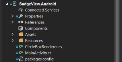
Em seu projeto .android crie a classe CircleBoxRenderer.
This file contains bidirectional Unicode text that may be interpreted or compiled differently than what appears below. To review, open the file in an editor that reveals hidden Unicode characters.
Learn more about bidirectional Unicode characters
| using Xamarin.Forms; | |
| using Xamarin.Forms.Platform.Android; | |
| using System.ComponentModel; | |
| using Android.Graphics; | |
| using BadgeView; | |
| using BadgeView.Droid; | |
| [assembly: ExportRenderer(typeof(CircleBox), typeof(CircleBoxRenderer))] | |
| namespace BadgeView.Droid | |
| { | |
| public class CircleBoxRenderer : BoxRenderer | |
| { | |
| protected override void OnElementChanged(ElementChangedEventArgs<BoxView> e) | |
| { | |
| base.OnElementChanged(e); | |
| SetWillNotDraw(false); | |
| Invalidate(); | |
| } | |
| protected override void OnElementPropertyChanged(object sender, PropertyChangedEventArgs e) | |
| { | |
| base.OnElementPropertyChanged(sender, e); | |
| if (e.PropertyName == CircleBox.CornerRadiusProperty.PropertyName) | |
| { | |
| Invalidate(); | |
| } | |
| } | |
| public override void Draw(Canvas canvas) | |
| { | |
| var box = Element as CircleBox; | |
| var rect = new Rect(); | |
| var paint = new Paint() | |
| { | |
| Color = box.BackgroundColor.ToAndroid(), | |
| AntiAlias = true, | |
| }; | |
| GetDrawingRect(rect); | |
| var radius = (float) (rect.Width() / box.Width * box.CornerRadius); | |
| canvas.DrawRoundRect(new RectF(rect), radius, radius, paint); | |
| } | |
| } | |
| } |
.Android:
iOS
Também crie uma classe CircleBoxRenderer no seu projeto .iOS, porém como demonstrada a seguir:
This file contains bidirectional Unicode text that may be interpreted or compiled differently than what appears below. To review, open the file in an editor that reveals hidden Unicode characters.
Learn more about bidirectional Unicode characters
| using Xamarin.Forms; | |
| using BadgeView.iOS; | |
| using BadgeView; | |
| using Xamarin.Forms.Platform.iOS; | |
| using System.ComponentModel; | |
| [assembly: ExportRenderer(typeof(CircleBox), typeof(CircleBoxRenderer))] | |
| namespace BadgeView.iOS | |
| { | |
| public class CircleBoxRenderer : BoxRenderer | |
| { | |
| protected override void OnElementChanged(ElementChangedEventArgs<BoxView> e) | |
| { | |
| base.OnElementChanged(e); | |
| if (Element != null) | |
| { | |
| Layer.MasksToBounds = true; | |
| UpdateCornerRadius(Element as CircleBox); | |
| } | |
| } | |
| protected override void OnElementPropertyChanged(object sender, PropertyChangedEventArgs e) | |
| { | |
| base.OnElementPropertyChanged(sender, e); | |
| if (e.PropertyName == CircleBox.CornerRadiusProperty.PropertyName) | |
| { | |
| UpdateCornerRadius(Element as CircleBox); | |
| } | |
| } | |
| void UpdateCornerRadius(CircleBox box) | |
| { | |
| Layer.CornerRadius = (float)box.CornerRadius; | |
| } | |
| } | |
| } |
.iOS:

Pronto, seu BadgeView já esta criado e agora você pode utiliza-lo em qualquer página do seu aplicativo.
Xaml
No arquivo xaml, crie um “Badge”, adicione a cor desejada na propriedade “BoxColor”, informe o tamanho do círculo nas propriedades “WidthRequest” e “HeightRequest”. Por último, passe dois argumentos do tipo Double, sendo eles: CornerRadius e FontSize (Tamanho do texto no interior do Badge).
Apenas para fins de demonstração eu adicionei um botão que quando clicado irá incrementar o valor 1 no contador de notificações. Porém, no seu caso você pode realizar binding com a propriedade que desejar. (<local:Badge Text=”{Binding Notifications}”)
This file contains bidirectional Unicode text that may be interpreted or compiled differently than what appears below. To review, open the file in an editor that reveals hidden Unicode characters.
Learn more about bidirectional Unicode characters
| … | |
| <ContentPage.Content> | |
| <StackLayout VerticalOptions="Center"> | |
| <StackLayout Orientation="Horizontal" HorizontalOptions="Center"> | |
| <Label HorizontalTextAlignment="Center" Text="Notifications" FontSize="18"/> | |
| <local:Badge x:Name="BadgeNotifications" BoxColor="red" | |
| WidthRequest="18" HeightRequest="18" | |
| VerticalOptions="Center" HorizontalOptions="Center"> | |
| <x:Arguments> | |
| <x:Double>30</x:Double> | |
| <x:Double>10</x:Double> | |
| </x:Arguments> | |
| </local:Badge> | |
| </StackLayout> | |
| <Button Text="Add Notification" Clicked="AddNotification"/> | |
| </StackLayout> | |
| </ContentPage.Content> | |
| … |
C#
This file contains bidirectional Unicode text that may be interpreted or compiled differently than what appears below. To review, open the file in an editor that reveals hidden Unicode characters.
Learn more about bidirectional Unicode characters
| … | |
| public MainPage() | |
| { | |
| InitializeComponent(); | |
| BadgeNotifications.Text = "2"; | |
| } | |
| private void AddNotification(object sender, EventArgs e) | |
| { | |
| if (BadgeNotifications.Text != "99+" && int.Parse(BadgeNotifications.Text) < 99 ) | |
| BadgeNotifications.Text = (int.Parse(BadgeNotifications.Text)+1).ToString(); | |
| else | |
| { | |
| BadgeNotifications.Text = "99+"; | |
| } | |
| } | |
| … |
Resultado

Esse e todos os exemplos deste blog encontram-se disponíveis no GitHub.
 Juliano Custódio
Juliano, como eu faria para mostrar esse badge em cima de uma botão ou de uma small image, tipo ícone ou um png de 48 X 48?
CurtirCurtir
Olá Paulo,
Uma alternativa é você criar o seu botão utilizando um StackLayout com GestureRecognizers para realizar o click. E dentro dele adicionar a badge.
Espero ter ajudado. Abraço
CurtirCurtir
Então, o badge está ficando fora do botão. Se eu aumento o width do botão o badge é jogado mais ao lado. O que devo alterar para ter o badge em cima do botão, não quero aqui dizer que sou novo e por isso tenho dúvida, mas não estou conseguindo utilizar corretamente. Tentei incluir no meu projeto e lá não funciona, não dá erro mas não aparece nada. É só isso, mas o seu exemplo é exatamente o que eu necessito, exatamente. Me desculpa mas falta alguma coisa ainda.
CurtirCurtir
Olá Paulo,
O exemplo que encontra-se no Github está funcionando, eu escrevi um código que faz a mesma coisa do exemplo, a diferença que é um botão que eu criei com um StackLayout.
Se preferir baixe o projeto do Github e substitua o xaml
This file contains bidirectional Unicode text that may be interpreted or compiled differently than what appears below. To review, open the file in an editor that reveals hidden Unicode characters.
Learn more about bidirectional Unicode characters
MainPage.xaml
hosted with ❤ by GitHub
Espero ter ajudado.
CurtirCurtir
Eu tenho esse link e não tem essa nova versão:
https://julianocustodio.com/2017/11/10/badgeview/
CurtirCurtir
Tentei incluir as classes e o badge(xaml) e não estou conseguindo fazer funcionar. É como se ele não reconhecesse a classe Badge no PCL. Baixei seu exemplo do git e funciona, mas se coloco no meu projeto eu não consigo fazer funcionar. Poderia me ajudar nisso?
CurtirCurtir
Juliano, descobri porque que não estava funcionando no meu projeto. Era por causa disto:
BoxColor=”red” e eu troquei para isso: BoxColor=”Red” mas no seu exemplo está funcionando e não se porque, mas resolveu no meu. Valeu!!
CurtirCurtir